Introduction
When you look back at the last decade of your life, what do you see? Which are the most important things that pop into your mind? Family vacation? Graduating from university? First kiss? Winning a competition? That moment when you, for the first time, held your baby in your arms? Or is it maybe some sad event, like losing a loved one? While these situations significantly shape our lives and make us who we are today, life of each individual consists of other, “background” processes and occasions. They almost certainly don’t come to our minds as being momentous, but they for sure affect our mood, relationships, and, overall, build our everyday life. One of these things is – you won’t believe – grocery shopping! It follows, at first sight, that grocery shopping is such an irrelevant part of our life. After all, it is nothing more than a routine, right? Doing laundry, brushing your teeth, reading generic e-mails from some random EPFL associations you have never heard of… – it seems like this is all done in a self-acting manner, automatically and mechanically. However, if you take a closer look, grocery shopping imposes heavy demands on our time, and has a direct impact on what we eat, how we spend our money and manage our time, which consequently influences our social life and well-being as a whole.
Let’s face it: grocery shopping isn’t a skill most of us would intentionally invest effort in pursuing. Nevertheless, people quite often find themselves in an unpleasant situation. Picture this! You want to prepare amazing spicy deviled eggs for the movie night with your friends, but you are missing chilli peppers and apple cider vinegar. Next thing, you find yourself in the super market looking for what you went for in the first place, but shiny packages and beautiful colors are occupying your attention and your senses. Suddenly, you return home with two bags of groceries, and guess what! – you didn’t buy jalapeños and vinegar! Why is it like that? Well, not having sometimes a clear idea about our inventory state, we end up being tempted into all sorts of treats that are over and above our necessities. Or, we plan to showcase our cooking abilities by preparing a plentiful lunch with several courses. So, we go shopping for various and numerous products – many of which we don’t need or are not needed in that quantity. Guided by our instinct and instant desires when grocery shopping, rather than being prepared and aware of what we really need, we end up with the fridge full of everything, often surprised by the number of items which have to be thrown away because the expiration date passed two months ago!

Through this story, we aim to address the following research question: What is the interplay between income and expenses, and how can it be used to help households organize their shopping? In particular, we are interested in the following aspects: How do households choose to organize their limited annual income according to their shopping expenses? Can we infer different household types based on the relation between their income and transaction statistics? Are there some demographic properties of the household’s indicators of this relation as well?
Data
The Dunnhumby dataset was our main source of shopping data, containing household level transactions over the period of two years from a group of 2,500 US households that are frequent shoppers at a retailer. The dataset contains the following information for each household:
- Demographic information including annual income, family size, homeownership, …;
- Product information including the product category (soft drinks, fruits, vegetables, …), manufacturer, …;
- Information about transactions including the purchased products, their prices, time of purchase, …;
Using this data we managed to discover many influencing factors on the balance between income and expenses. As such we wish to share this knowledge, for any reader interested in learning how to ride the shopping cart, or anyone just trying to avoid the shopping cart running over his wallet. It’s easy! You just have to follow these 5 simple steps:
1. Make you sure you’re earning enough to buy that fancy organic avocado!
You know, not everyone is in the top 1%…1

As expected, our analysis demonstrated that one of the major factors in detecting the household expenses is the annual income of a given household. The main challenge in utilizing this information from the datasets was the fact that we didn’t have exact numeric data about the household incomes. Instead, we were provided only with different income categories. On the bright side, there is a meaningful order in the categories as they are intervals. The most challenging thing here was finding an appropriate numerical representation for each income category. We did so by fitting the data to the log-normal distribution. Even before seeing the income distribution, we already assumed that it would be log-normal, as this is the usual distribution of positive random variables. This follows from the central limit theorem, applied to variables which cannot be negative (like household income).
Namely, we could simply plot the number of households contained within every income category, and get the following plot:
Whilst there is nothing wrong with this plot on the first sight, in-close analysis reveils a large problem with it: the bins are not equidistant. That is, in the second lowest bin (15-24K) there is only a range of 9,000 USD, while there is 49,000 USD income range in the second highest bin (200-249 USD). Accordingly, it is biased towards bins of a larger range. For a fair plot, we need to divide all the bins by their range. By doing that, we get an approximate income distribution density of the number of households per 1,000 USD income range. Since the data is non-nummeric, we still won’t be able to get a nice and continuous distribution of the income, but at least it will be unbiased towards larger ranges.
By just looking at the above-given plot, one may already get the feeling that it looks like the log-normal distribution. In order to actually verify this, we need to use the maximum likelihood estimation to infer the parameters of the log-normal distribution. Given that the income categories are still non-numerical values, we must convert them into numbers. Naively, we were tempted to simply take the average value of the lower and the upper bound of each bin. However, bearing in mind that the data approximately follows a log-normal distribution, we have to use the geometric mean of the upper and lower bound2.
2. Don’t throw away your bills!
Statistics is your friend…
Average bill amount
As our ultimate goal in this research is to be able to measure the spending habits of different households, we should, for that reason, compute the average amount of each household’s bills. Every visit of a particular household to a store is uniquely identified in the dataset. We can do this in two steps:
- We sum the total bill amounts for each household.
- We average across all visits which a given houshold made over the whole time period.
Here you can see the distribution of the average bill amount. On average, people spend around 30 USD per visit to a local supermarket. However, there are several outliers. This is further investigated later on in the analysis.
Average number of products
Concurrently, we are also interested in finding the average number of products purchased per household. Why is this important? The relevance of it is reflected through bills of large families. This household category will always have higher bills per visit to the supermarket, simply because they have to buy food for more family members. At the same time, smaller and wealthier families (perhaps without children), are expected to purchase fewer products, often for higher price. On average, people buy around 10 products per supermarket visit.
Average median product price
While the average number of purchased products is a really good indicator of a household’s spending habits, we argue that the average bill amount is actually dependent on two very different parameters. It is to be expected that the average number of products is proportional to the household size (after all, rich and poor families drink and eat rougly the same amounts of food3). Simultaneously, the average price per purchased product is expected to be more closely related to the wealth of a given household (for example, wealthy families might be incited to purchase more expensive wine, or buy organic food). The total bill amount is roughly equal to the number of purchased products and to the price of the average product. Therefore, small wealthy families could have similar total bill amounts as poor large families. In this respect, we are interested in the distribution of the average median product price. We use the median for calulating the average, as it is more robust to outliers.
Correlation analysis
One of the first things we learned in elementary school is a precious rule applicable in a daily life: the average is equal to the sum divided by the quantity. When it comes to grocery shopping, this is no different. The average bill we pay in supermarkets will be dependent on how many items we purchase and what is their average price. Obviously, there exists a 1:1 correspondence between the number of purchased items and the total bill we have to pay at the checkout. As the variation in price of everyday items is not large, the variance is very small:
Things become less obvious when we compare the average median product price with the average bill amount. The main factor which causes uncertainty here is the number of products, which varies greatly. It depends on how often we go shopping and how many family members we need to feed with a one “go” to the local supermarket. Thereby, we have a very significant variance in the following plot:
We observe that the average number of products is uncorrelated also with the average median product price. This is expected as it follows from the other two results. So we have two pairs of uncorrelated statistics, however as the average bill amount is obviously more expressive than the number of products, the final decision is definitely to completely forget the latter.
Analysis of the Joint Distribution
Given our insight into how much money, on average, households spend during each visit to a supermarket and how the representative product price varies, we are interested to find out if the household income plays a crucial role in the spending habits. Our expectation is that it does, and that households with lower income spend less and buy cheaper (for example non-organic) products as opposed to households with higher income.
Using a boxplot we can view the distribution of the statistic across each household income category and perform a comparison very efficiently.
It is surprizing to see, that extreme spending was mostly observed for medium and lower income households. After having a closer look at the data, we found out that this is mainly due to the fact that there are significantly more households in the average-income range, as in the high-income range4. Therefore, we also expect more outliers in the average-income range.
We also created the same plot for the average median product price:
This is relevant, as we expect wealthier households not necessarily to buy larger quanitites of products (which is mostly responsible for the average bill amount), but rather to purchase individually more expensive items. However, we observe extreme spending more often for medium and lower income households here as well! Curious…
3. Don’t forget to exploit the weekend discounts!
Remember that the Swiss are wealthy because they spend less and not vice versa…
Coupon usage
Our analysis showed that coupon campaigns play a major role in how people spend their money. In deriving the true amount of money that households spend on every visit to their local supermarket, we took into account the coupon value. Households which regularly participate in loyalty programs, may end up paying less money, even if they purchase more expensive products. Let us find out what the total amount of coupons used is and how it varies with annual income!
The reason why coupon values are negative is, because they decrease the final bill, so here we use the absolute value. On this bar plot, we see a somewhat unexpected trend. People with medium to upper medium income use more coupons as opposed to the people with lower income. An interesting sight is that people with high income are also heavy users of coupons. While it is difficult to draw any certain conclusions, we can speculate that people with high income are more careful with what they spend money on. After all, that might be the reason why they have such high income. At the same time, household with lower income might not be able to profit so much from discounts, as high-reward loyalty programs are more benefitial to people who actually spend larger amounts of money.
Daily Expenses
Interesting information can be found by looking into the day of the week when purchases have been made. While we don’t know the exact date (and thereby day of the week) from when the data was recorded, it is enough to group the transactions by the day number modulo 7, in order to plot the transactions throughout an average week.
While we cannot be certain about which day this weeks starts with, it is to be assumed that that the two days with a larger amount of transactions are either Friday and Saturday or Saturday and Sunday. If the data is from the US, it is likely that most purchases have been made on Sunday, as people tend to have more time for shopping, and the stores are usually open on Sunday.
4. Buy only what you need, or at least what you think you need.
The types of products you buy can say a lot about you…
Most Purchased Product
We want to find out on which products the different households spent most of their income in, and how this depends on their income categories. After analyzing the data, we found that the households from every category spent most of their money on… gasoline ?! Makes sense as everyone needs to get from A to B, right? Let us see the distribution in USD for every income category:
The distribution is highly concentrated around the middle to upper middle income categories. The reason is that households with lower income can’t afford owning a vehicle, however the reason for the upper income is somewhat unclear. It could be that they use other means of transportation required by their job.
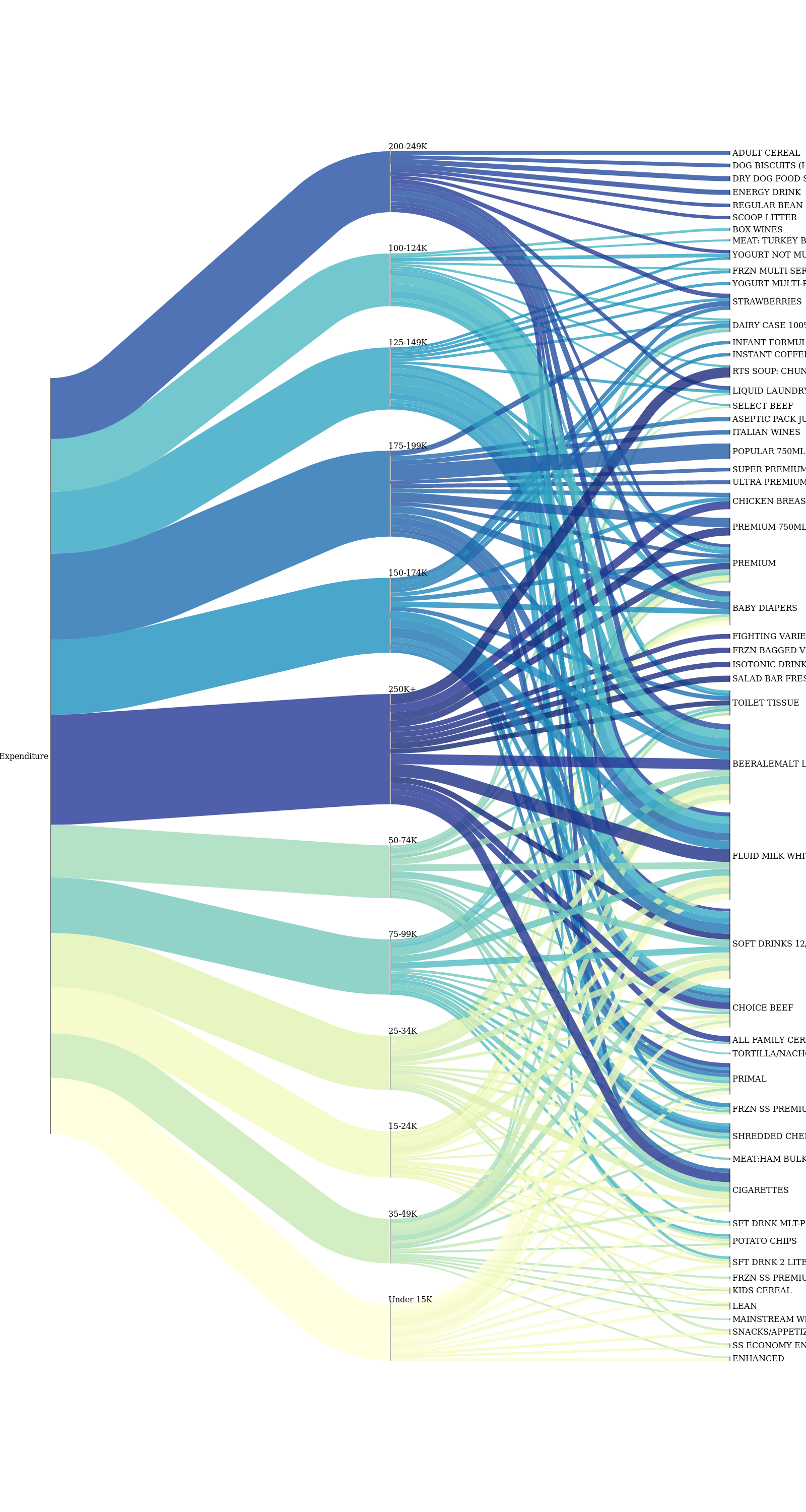
Flow of expenses between income and product categories
Setting gasoline aside, we are also interested in how the expenses are distributed in the other product categories. Take a gander at the beautiful plot below! It is an excellent way to visualize flow of information between two subsets. From it, we have a clear idea about how the expenses from income groups map to product categories and we used only the 200 most purchased products ordered by their quantity for this.
Engel curves
After visualizing how the quantity of the purchased products is distributed we can search for patterns in the expenditure, by calling on a principle from microeconomics, called Engel curves. These plots represent one particular way of determining how household expenditure, on a particular good or service, varies with household income. Engel curves on the x-axis have the income category and on the y-axis the quantity of the measured product. We can infer some type of goods using these curves.
Boom, multiple birds with one stone! We can infer many interesting insights from these curves.
On one hand, some fancy products like imported wine and veal are purchased asymmetrically more by higher-income households.
On the other hand, there are the inferior goods. Margarine is an inferior good since its demand drops when people’s incomes rise. This occurs when a good has more costly substitutes (butter) that see an increase in demand as incomes and the economy improve. There are other examples in our dataset (ex. frozen food, prepared food, peanut butter and jelly) and we can observe that the Engel curves for these products are very similar in shape.
When looking at the above plots, one might be surprised that for all products, households with extremely low incomes, and households with extremely high income tend to purchase fewer of them. For households with low income, this is no surprise. But what about high-income households? It is likely that individuals of high incomes often dine out, as this saves time. That way, they don’t have to purchase large quantities of any products in supermarkets.
5. Know who you are, but more importantly who you are not.
Always stick to the good family values…
In order to understand how family values influence the balance between household’s expenses and income, we will analyze the demographic properties across 4 groups of households:
- Households with low income and low expenses (41%)
- Households with low income and high expenses (31%)
- Households with high income and low expenses (9%)
- Households with high income and high expenses (19%)
We generated these groups using the average income and average expenses, by splitting the households into: below (or above) average income and below (or above) average expenses.
Age
From the age distribution of the household groups, we can make a few interesting observations. Among the households with the youngest members there is not a lot of variety in the income-expenses balance. Among the households with members of younger working ages high expenses seem to dominate. As we move to the households with older members lower expenses are more prevalent.
Marital Status
The following plot very effectively illustrates the usual differences between “single” and “married” life. We observed that households with married members have more often lower income and must balance with lower expenses, while the opposite is true for single member households, as they more frequently have higher income and are able to indulge in higher expenses.
Homeowner Type
Another interesting future included in the dataset is, whether families own or rent the property they live in. It is understandable that households, which are able to afford their own place of residence, entail probability of a higher income and expenses, while renters usually have better sense of utilizing their limited income.
Household Composition
When considering the different household compositions indicated in the data, we do not observe a great variety of the results. This feature doesn’t seem to be a good discriminator. However, we do observe two interesting discrepancies which can also be expected: couples with no children have the highest chance to be in the group with the highest income and expenses, while single parents have a harder time paying their bills.
Household Size
The size of a given household also displays very little effect on the spending habits. However, we can observe a trend which demonstrates us that the probability of having lower income and expenses decreases as the household size increases. This is so because only households with higher income can afford to have more children. Nevertheless, this circumstance makes their expenses increase as well.
Number of children
We can infer the demographic records for the number of children from other features such as household size and household composition. In this context, we observe in the plot a similar trend as in the previous analysis of a household size. Having children costs money!
Recap
So to summarize, from our analyses we discovered several factors that contribute to how people spend their annual income:
- Household income category
- In our dataset we have several categories ranging from below 15,000 to over 250,000 USD p.a. and everything depends on this membership
- Shopping habits
- It mainly depends on the day of the week
- Advertisement campaigns
- Some households take active participation in campaigns which significantly lowers the expenses
- Products vary in price
- Some products are much more expensive than others; nonetheless, their purchase is unavoidable
- Household’s preferences
- Households with lower income tend to buy low-budget goods, as opposed to households with higher income which seek to purchase high-end goods (like organic food)
- Demographics
- Marriage and having children costs money